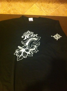
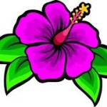
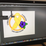
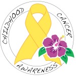
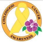
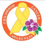
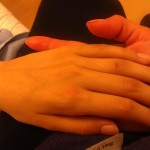
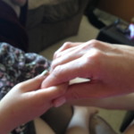
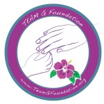
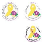
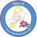
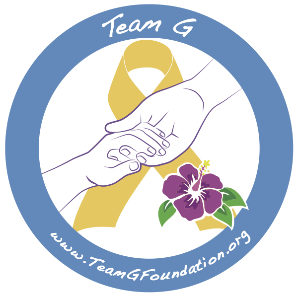
The Team G logo was designed by my brother, Tem who is a Graphic Designer. Gold is the color of the childhood cancer ribbon. Since gold has proved to be a challenge in printing, we’ve altered the color of the ribbon from a yellow to a yellowish gold in honor of the actual gold for childhood cancer. This is what centers our logo and and our foundation. Two hands coming together, the actual tracings from pictures of our Tianna at age 14 and Gabriella at 4. The hibiscus represents courage, honor and life to represent children fighting cancer and we chose purple to represent Gabriella’s fighting color. The flower also represents gentle beauty and beginning of a journey, which would prove to be the toughest of our lives. Blue has been the favorite color of Tianna which encircles our logo.
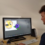
As you can see, the logo took on many shapes, forms and fine tuning to bring it to perfection. My brother and I worked long hours and many days to come up with a powerful representation of what our foundation represents. We wanted to make sure this was something that reflected our passion, hope and represented our two girls coming together for all children fighting cancer.
The hands were the most important part of our logo. Since our Tianna was the one who reached out to Gabriella, we represented this with Tianna’s hand coming down from the right side reaching down to Gabriella’s.
What we came up with:
As we grow as a foundation, our logo will evolve as well. I think we can all agree as a board that we love seeing our logo out there and knowing what it represents. I can’t thank my brother Tem enough for the time and energy he’s taking to help create our vision for a logo!
Kristin, Founder and Executive Officer
